Every autumn, a client forwards us a list of web design trends and asks the same quiet question: “Should our site look like this?” This year the lists feel different. Generative tools can now produce a slick, competent homepage in minutes. As a result, slick and competent have stopped standing out.
So the design world is pushing in two directions at once. On one side, studios are leaning into texture, character and visible human choices. On the other, the real-world sites that bring in leads are doubling down on speed, accessibility and calm navigation.
In this post, we walk through eight web design trends we expect to shape 2027. For each one, we say where it helps, where it is still unproven, and how we would use it on a real business site.
Why web design trends are swinging back to the human
When everything looks machine-made, proof of a human hand becomes valuable. That is the thread running through the first two web design trends on our list.
Human imperfection and anti-AI polish
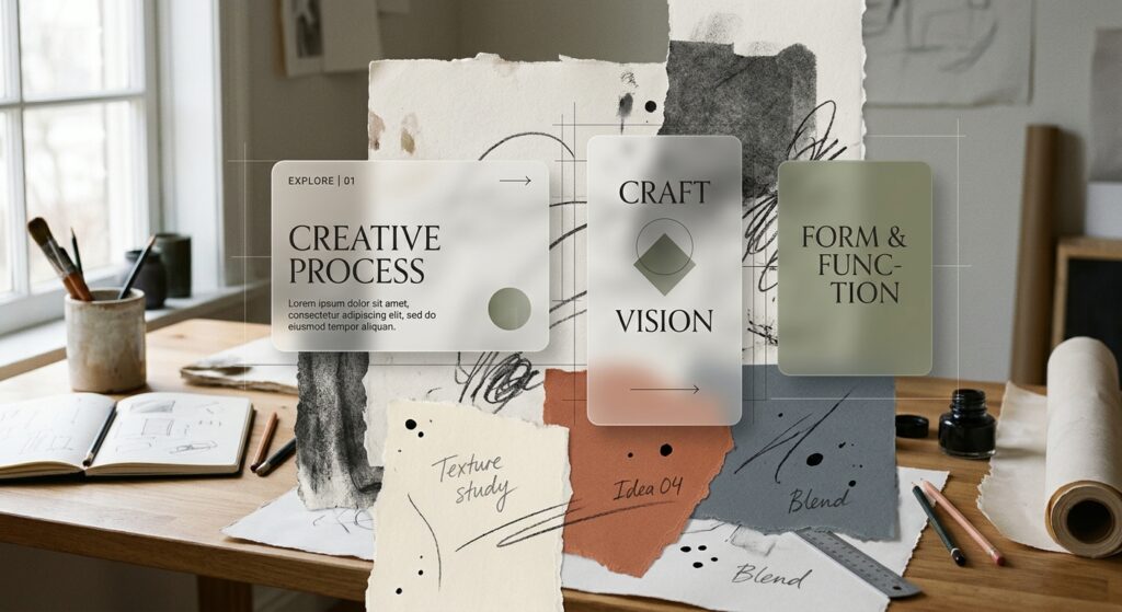
Designers are answering the flood of AI layouts with collage-style grids, mixed raw textures, visible grain and details that feel slightly off on purpose. For example, Canva framed 2026 as the year of “Imperfect by Design”, and Kirki’s 2027 forecast expects the idea to carry forward.
However, imperfection is easy to fake and hard to do well. A broken grid still needs a clear reading order. Therefore, we treat “unpolished” as a finish applied to a solid structure, never as a replacement for one.
Handmade and analog design
Real photography, paper scans, film grain and hand-drawn marks are being spliced into digital interfaces. The goal is to ease digital fatigue and make a brand feel touchable.
This one suits hospitality and craft businesses especially well. For instance, our redesign for VietnamHouse Restaurant in Barcelona leaned on real food and family recipes rather than stock imagery. That said, scanned textures are heavy files. Compress them, serve modern formats, and keep them out of the critical loading path.
Cute-morphism and mascot branding
Tech and AI companies are adopting mascots, custom characters and playful illustration. A friendly character softens a technical product because it gives people something to remember.
In our view, a mascot works when it has a job, such as guiding onboarding or making error states less stressful. In contrast, a character bolted onto a corporate site with no role tends to feel like decoration. Also, this trend is driven more by designer commentary than by hard data so far, so treat it as a branding decision rather than a conversion tactic.
Oversized, personality-led typography
Instead of the default geometric sans-serif, brands are choosing giant headlines, distinctive serifs, custom handwriting and variable fonts. A variable font is a single file that holds many weights and widths, so you get more expression with fewer downloads.
Of all the web design trends here, type is the cheapest way to make a site feel like yours. Still, oversized lettering needs testing on small screens, and every custom typeface should pass contrast checks. In short, personality should never cost legibility.
Web design trends you can feel: motion and depth
The next two shifts change how a page behaves, not only how it looks.
Motion handled by the browser
Instead of loading large JavaScript animation libraries, more teams now use native CSS. Scroll-driven animations, which link an animation’s progress to the scroll position, can replace many scroll-listener scripts. You can read how they work in MDN’s guide to scroll-driven animations.
Here is where it stands today (November 2026). Chrome and Edge have supported it since 2023, and Safari added it in Safari 26. However, Firefox stable still keeps it behind a flag, so we build it as progressive enhancement:
css
@supports (animation-timeline: view()) {
  .reveal {
    animation: fade-up linear both;
    animation-timeline: view();
    animation-range: entry 0% cover 30%;
  }
}
As a result, visitors on older browsers simply see the content without the effect. We also respect prefers-reduced-motion for anyone who has asked their device for less movement.
Spatial UI on 2D screens
Similarly, interfaces are borrowing depth cues from spatial computing and AR, without needing a headset. Think layered cards with subtle physics, cursor-reactive lighting and restrained glass effects. Graticle’s early 2027 predictions describe this as preparing users for a more three-dimensional web.
Of the more experimental web design trends, this is the one we like most for its tactile feel. However, the evidence behind it is thin. Depth also adds rendering cost and can confuse people using screen readers or keyboards. Use it for one hero moment, then let the rest of the page breathe.
Thinking about a refresh for 2027?
Perhaps we can build something enduring together.
AI-ready and contextual architecture
Websites are now read by machines as well as people. AI assistants summarise, quote and compare your pages. For example, Adobe’s 2026 research, as reported by Anala, found that slightly more consumers used AI platforms as a frequent information source than brand websites.
So being AI-ready mostly means good habits done well. Use clean semantic HTML, one clear heading structure, consistent facts across every page, and structured data where it fits. We covered the block-level side of this in our developer’s guide to the WordPress Block Editor.
Contextual personalisation is the second half. Instead of one static homepage for everyone, the site adapts to what a visitor needs. Then a returning member skips the intro, or a visitor from an event campaign lands on the right page. Start small, though. Personalisation that guesses wrong erodes trust faster than a generic page ever could.
The web design trends that actually pay the bills
While experimental styles dominate design reels, small and mid-sized business sites are investing in unglamorous essentials. These are the web design trends we would fund first.
- Fast Core Web Vitals. These are Google’s measures of loading, responsiveness and visual stability. A Deloitte study from 2020 found that a 0.1-second speed gain lifted retail conversions by 8.4%. We shared our own approach in how we scored a near-perfect 96.
- Accessibility as a baseline. The European Accessibility Act has applied since June 2025. In the US, the Department of Justice moved its ADA Title II deadline for larger public bodies to April 2027. Meanwhile, private businesses still face accessibility lawsuits. Build to WCAG 2.2 from the first wireframe.
- Frictionless mobile navigation. Put the call, the route and the opening hours where a thumb can reach them. Then make the contact path impossible to miss.
Our take: how to use web design trends without chasing them
Web design trends work best as a shared vocabulary for your team. Here is how we would approach a 2027 refresh:
- Fix the foundations first. Audit speed, accessibility and mobile journeys before touching the visual layer.
- Pick one expressive move. Choose texture, typography or a mascot, whichever fits your story, and do it properly.
- Prefer native over libraries. Use CSS motion with fallbacks, and drop scripts nobody can justify.
- Structure content for people and machines. Clear headings, honest facts and consistent details help both.
- Test with real users. Above all, a trend that confuses your customers is the wrong trend for you.
This is how we build our custom web design projects: deceptively simple on the surface, carefully engineered underneath.
The Bottom Line
The strongest 2027 sites will feel human, load fast and work for everyone. The experimental styles are worth borrowing in small, deliberate doses. Meanwhile, the fundamentals remain what turns a visitor into a client.
At TERAX, we believe good design is quiet excellence: a few confident choices on top of a structure built to endure.